Client: Hotel Ny Hattenæs
Work: Graphic Design Guide
Graphic identity for
Hotel Ny Hattenæs
A Graphic Guide has been created for the re-opening of the old Hotel Ny Hattenæs in Silkeborg (DK). In close collaboration with the owner’s of the hotel, our goal was to establish a cohesive and inspiring visual identity that preserved the hotel’s unique heritage while introducing modern elements.
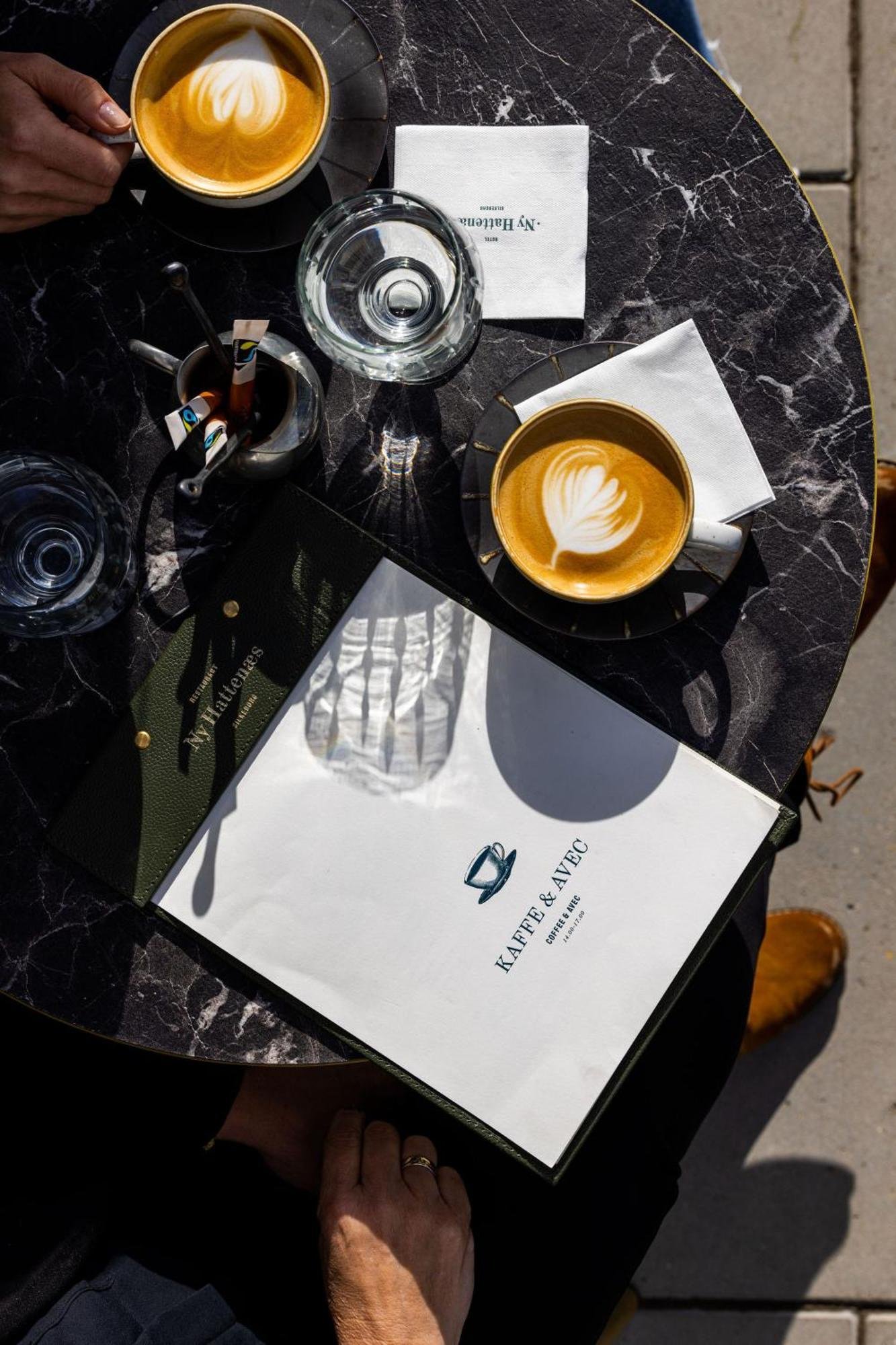
Templates for menu cards
Signage
A close collaboration
To achieve our goal, we worked very carefully with selecting the right colours and typography that would truly reflect the hotel’s unique heritage.
The color palette evoke a sense of history and comfort, grounding the space in its rich past, yet offering a modern sense of sophistication.
For typography, we chose a mix of serif and sans-serif fonts to balance tradition and contemporary style. The serif fonts hint at the hotel's classical roots. Our goal was to ensure the typography feels both authentic and easily accessible, enhancing readability without distracting from the space’s atmosphere.
-

British Racing Green
-

Aurora Red
-

Old Ivory


Graphic guidelines
New logo + usage / Illustrations / Colours / Typography / Templates for menus / Digital frontend / Signage
The guide includes guidelines for logo, colours, typography, logo usage, and signage, ensuring a professional appearance across both print and digital platforms. By adhering to these guidelines, we can strengthen the brand and attract guests as we usher Hotel Ny Hattenæs into a new era.

Every detail was carefully thought out to weave the hotel's heritage into every visual element—making sure that the graphic design feels deeply connected to its story, yet perfectly suited for today’s guests.